|
Minimalism is exactly what it sounds like. Instead of focusing on a deeper meaning, or some sort of theme, the artists focus on the raw materials themselves. Half of the movement is basically some wooden blocks, and yet, the simplicity is meaningful in it's own way. I was trying to think of what to make for my movement, and we had just made stencils, so I decided to make another one. I looked through several pages of minimalistic Disney princesses before deciding to pay tribute to my sister's favorite person. Harry Potter was a pretty good choice, because his three main features are his hair, his glasses, and his lightening bolt scar, all of which are featured in my piece. 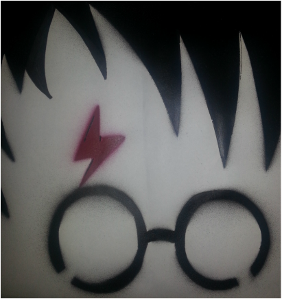 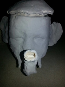 This is one of several baby heads. This one is my favorite. I was inspired by the Pinterest board 'Vessels' (https://www.pinterest.com/artofapex/vessels/). I picked clay, because the Mrs. Sudkamp (You? Idk...) had just found those baby head molds, and I thought they were hilarious. My piece is similar because it's creative and I saw a bunch of cool teapots on the board. It's my own because I don't think anyone's ever made a baby head teapot, mostly because it's a little creepy. I thought I was successful in morphing the baby and the elephant. I was maybe not as successful at making the lid fit. Other than that, I love my piece, and the other ones I made.
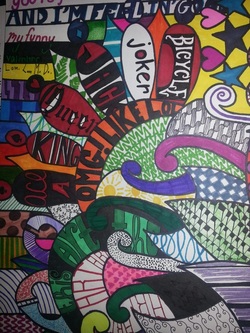 Zentangle: I thought this was more fun than it was relaxing, mostly because I was so excited about making it. Does "Zen" match this style? Nope, not at all. I used bright colors and poppy patterns. I'm not that great at patterns per say, but I like fonts, so I did a bunch of font work. I had started with a different picture, and lost inspiration, so I drew a bunch of lines and went from there. 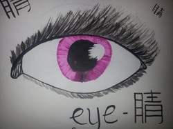 Eye: It may not be the best eye I've ever drawn, but I liked using ink for the first time. I thought it was a little challenging, but I got through it by trying to keep my own style in my piece. As you can see, I 'inked' an eye, and wrote the word 'eye' in Chinese. 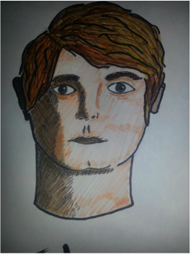 Inspired InK:
I found a drawing of Sherlock Holmes (Benedict Cumberbatch) in ink, using a type of hatching as a technique. I decided to draw his other half, John Watson (Martin Freeman) to make a matching set. I used colors and crosshatching to create a range of values. My process, as always, was to just start drawing, and then I asked a ton of questions, hoping to create a worthwhile piece. 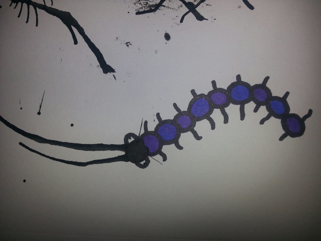 Clay "Fish": Alright, so it's not a fish. I had a hard time making eyes and the mouth part, but Mrs. Sudkamp helped with the eyes, so that was better. Unfortunately, as you can see, the snout is forever messed up. I don't completely love fish ceramics, so I decided to make a wolf-type thing. My process in general involves thinking about something I want to do, and then I do it. Which is exactly what I did. So, yeah. Ink Monster: It's kind of hard to control specifically where ink goes when you drop it on paper. My struggle was that 1. I couldn't control the diddly darn ink, and 2. When the ink went somewhere, I didn't have a clue what to make. I finally just put a drop on the paper, blew up, and added a body. My process was basically nonexistant, but I love how it turned out. It's so cute! 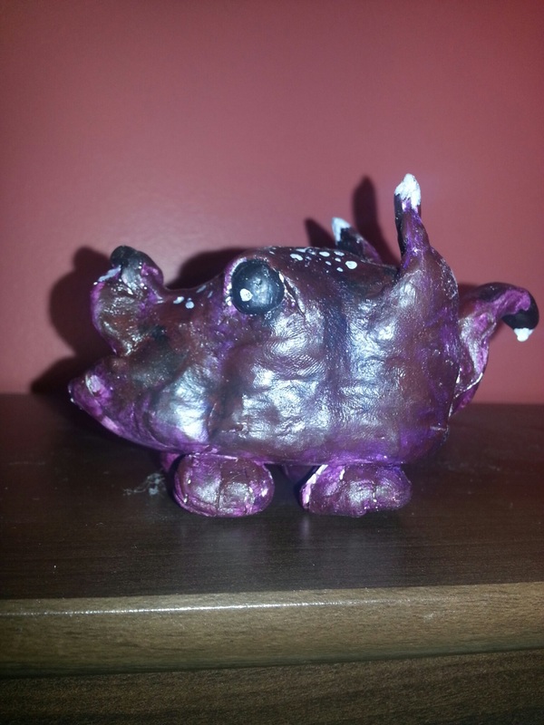 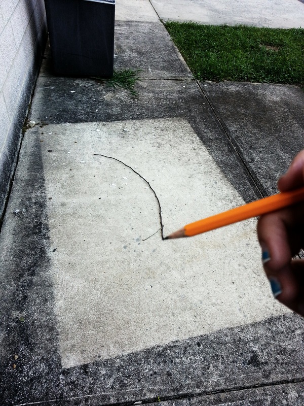 I struggled with this picture for two reasons. One, I wasn't working with anyone, so I held my phone in one hand and the pencil in the other. Two, the phone's focus was weird, so the pencil is blurry.
Since I didn't have a partner/group, it was hard coming up with a solid idea that only used one person. |
ClaireI'm artsy. Oh well. Archives
October 2015
Categories |
 RSS Feed
